Chapter 2. The Absence Ladder
The claim this chapter defends
Measured, Volume II. Across 616 recorded absences from 85 B2B software companies in 60 categories, the kind of question a company loses to an AI answer changes systematically as its visibility rises: companies named in zero of ten answers lose category-level questions 55.3% of the time and head-to-head comparisons 20.0% of the time, while companies named in seven or more of ten reverse that to 12.5% and 68.8%. The pattern is significant across all four tiers (chi-square 61.8, df 15, p = 1.3 × 10⁻⁷). Reasoned. Invisibility is not one condition. It has stages, and the work each stage implies is different.
Operator disclosure. Broadcastwell ran this measurement and sells services in the category it measures. Broadcastwell is excluded from the measured sample and from every ranking. The mitigation is not that the conflict is absent, it is that the raw data and the code are public and the result can be recomputed by anyone who disagrees.
A single percentage is a symptom, not a diagnosis
Reasoned. A visibility score of 2 out of 10 tells you that eight answers went by without you. It does not tell you what those eight answers were about. Two companies can both score 2 and sit in entirely different strategic positions. One is losing every best-of shortlist in its category and never gets considered at all. The other appears on the shortlists and loses only head-to-head comparisons against one named rival. Those are different problems with different fixes and different costs, and a single percentage hides the difference completely. The number is real. It is just not a diagnosis.
So invert the unit of analysis
Measured, Volume II. The standard approach studies the answers where a company appeared and counts them. Volume II did the opposite. It studied the answers where the company did not appear, kept the full text of every one of those questions, and asked what they had in common. Reasoned. That inversion is the whole method. Presence data tells you how much visibility a company has. Absence data tells you what kind of visibility it is missing, and that is the thing you can act on. Everything in this chapter follows from measuring the losses rather than the wins.
What was measured
Measured, Volume II. 85 B2B software companies across 60 distinct product categories. For each company, ten buyer questions reflecting how a real purchaser researches that category. Each question was put to one AI engine with live web search enabled, one run per question. For every answer the study recorded whether the company's brand was named, whether its domain was cited as a source, and which competitor was named most often. The sample is challenger-skewed by construction: companies were selected as plausible non-leaders in categories with an identifiable incumbent, which is the population where a visibility gap is actionable at all.
Why the category count is 60 and not 61
Measured, Volume II. Volume I of this research programme reported 61 categories. That figure counts every category string in the collection sheet, including one category whose company was queued but never scored. Volume II analyses only companies with complete scores, which is 60 categories. The 85 companies are the same in both volumes. This is stated here rather than left as an apparent contradiction between two published papers, because a reader checking one number against the other will otherwise find a discrepancy that is not one.
How 616 absence records were built
Measured, Volume II. For every question where the company was not named, the study retained the full question text. That produced 616 absence records. Completeness was then validated directly rather than assumed: for all 85 companies, the absence count equals ten minus the visibility score, with zero mismatches. Reasoned. That check matters more than it looks. It means no absence was silently dropped and no answer was double counted, so the denominator of every percentage below is the complete set of losses rather than a convenience subset of them.
The six question shapes
Measured, Volume II. Each absence question was assigned exactly one shape by regular-expression rules applied in fixed precedence.
| Shape | Rule | Example |
|---|---|---|
| Head-to-head comparison | contains "vs", "versus", or "comparison" | "Whitespace vs Artificial Labs: which is better?" |
| Alternatives-to-incumbent | contains "alternative" | "What are the best Sequel alternatives?" |
| Best-of shortlist | contains "best" or "top N" | "What is the best resource management software?" |
| Evaluation criteria | evaluate, choose, select, criteria, pricing model | "How should I compare pricing models when switching?" |
| Use case or problem | opens "how can/do/does" or contains "use case" | "How can this software reduce manual data entry?" |
| Definitional | opens "what is/are" without "best" | "What is reinsurance placement software?" |
Measured, Volume II. 2.8% of records fell to other. Precedence matters and is published so the classification is reproducible: a question containing both "best" and "vs" is counted as a comparison, not a shortlist.
The result
Measured, Volume II. The distribution of absence shapes shifts systematically with visibility.
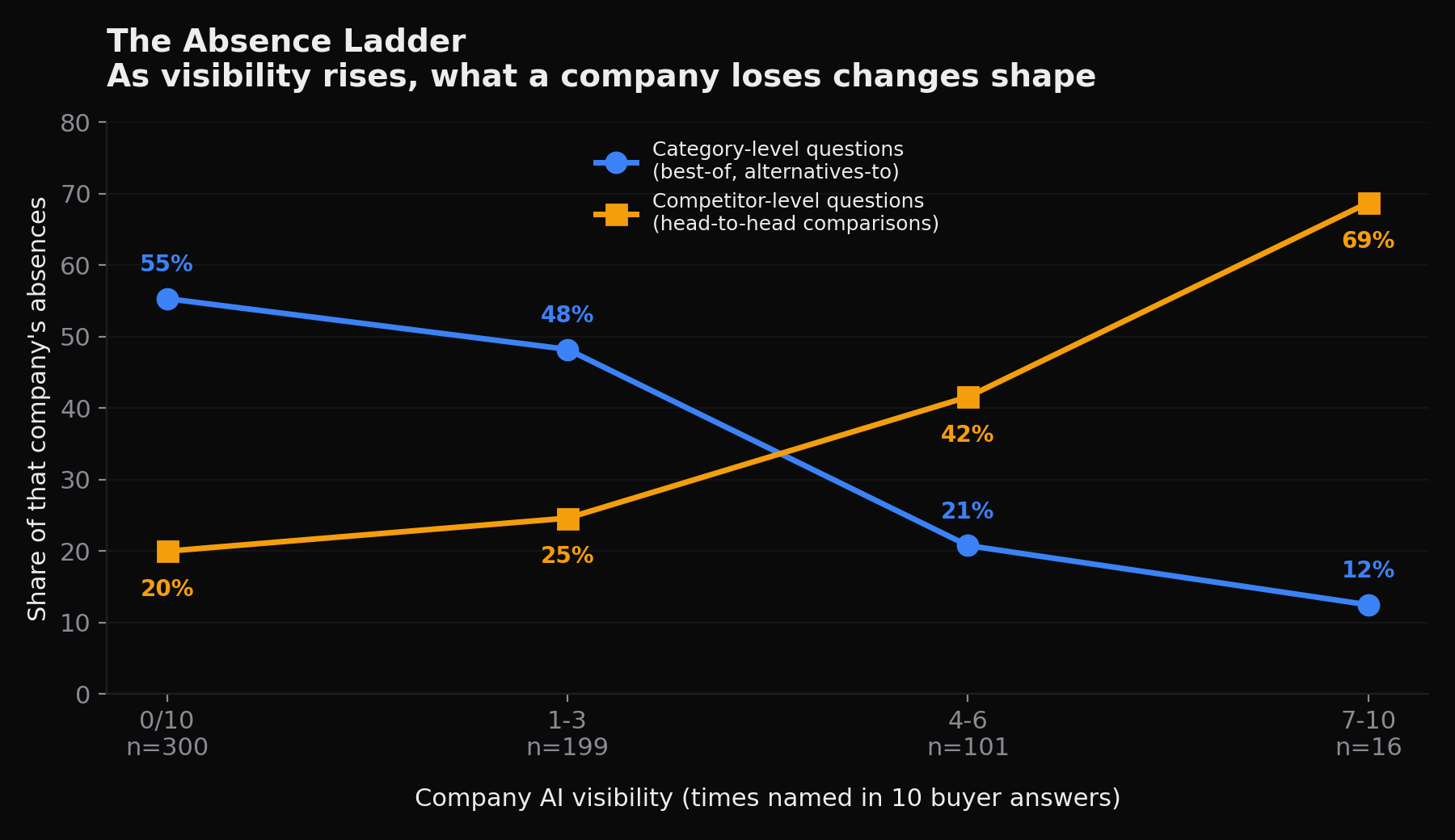
| Visibility | Companies | Absences | Category-level | Head-to-head |
|---|---|---|---|---|
| Named 0 of 10 | 30 | 300 | 55.3% | 20.0% |
| Named 1 to 3 | 25 | 199 | 48.2% | 24.6% |
| Named 4 to 6 | 21 | 101 | 20.8% | 41.6% |
| Named 7 to 10 | 8 | 16 | 12.5% | 68.8% |
Measured, Volume II. Category-level means best-of shortlists plus alternatives-to-incumbent queries.
What the top row rests on, stated before anyone asks
Measured, Volume II. Nine companies scored 7 or above. One of them scored 10 of 10 and therefore produced no absence records at all, so the top tier's absence analysis rests on the remaining 8 companies and their 16 records. Company counts across the four tiers sum to 84 in the table above and to 85 in the sample, for that reason. Reasoned. The 68.8% comparison figure is the most quotable number in this chapter and it rests on the smallest base in it. Anyone repeating it should repeat the base with it.
The statistics, in full
Measured, Volume II. All four results below are computed in Volume II from the same 616 records.
- Chi-square across tier by shape: χ² = 61.8, df = 15, p = 1.3 × 10⁻⁷, Cramér's V = 0.18.
- Visibility against absence-is-category-level: r = −0.284, p = 6.8 × 10⁻¹³, n = 616.
- Visibility against absence-is-comparison: r = 0.234, p = 4.1 × 10⁻⁹.
- Excluding the small top tier entirely, the comparison effect survives: r = 0.184, p = 5.9 × 10⁻⁶, n = 600.
Reasoned. The last line is the one that decides whether the finding is an artefact of 16 records. It is not. Drop the top tier completely and the relationship between visibility and comparison-shaped absence still holds at n = 600.
Two gates, not one wall
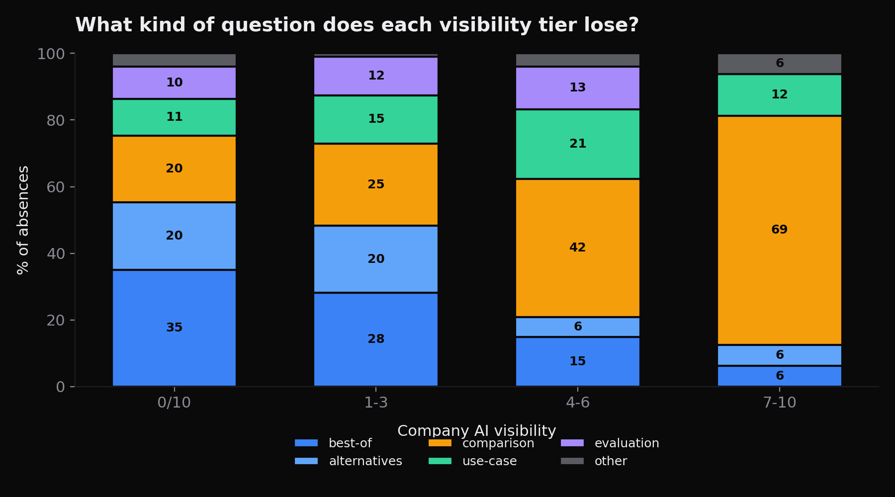
Measured, Volume II, and reasoned from it. A company named zero times is failing at the category door. The engine does not consider it a member of the set when a buyer asks who the players are. More than half of its losses are questions that never mention a competitor by name. They simply ask who exists, and the answer does not include it. A company named seven or more times has cleared that door and is a recognised member of the category. What it loses now is the second gate: direct comparison against a specific named rival. Nearly seven in ten of its remaining absences are comparison questions.
Why the middle tiers matter to the argument
Measured, Volume II, and reasoned from it. If the two gates were simultaneous, the middle tiers would look like noisy blends with no order to them. They do not. The 1 to 3 tier sits close to the zero tier, at 48.2% category-level against 24.6% comparison. The 4 to 6 tier has already flipped, at 20.8% against 41.6%. The mix moves monotonically in both columns across all four tiers. That is what a sequential process looks like when you cut it into slices, and it is the reason the finding is described as a ladder rather than as a correlation.
The practical consequence, which is the point of the chapter
Reasoned. The work implied by each stage is different. A company at the category door needs entity presence and inclusion in the third-party sources engines consult when assembling a set. Its problem is membership. A company at the comparison gate needs comparison content that a model can quote against a specific named competitor. Its problem is preference. Prescribing the second to a company stuck at the first is a common and expensive mistake, and a single visibility percentage cannot tell you which one you are. The absence mix can.
What this does not license you to conclude
Reasoned. The ladder describes where a company sits, not why it got there and not what happens if it acts. Nothing in this dataset is an intervention study. No company was measured, changed and measured again. The finding is that absence shape and visibility level move together across a cross-section of 85 companies at one moment in time. Reading it as a causal claim that fixing category presence produces movement into the next tier goes beyond what was measured, however plausible that reading is.
Limitation: one engine, one run per question
Measured, Volume II. All answers behind this analysis came from a single AI engine with live web search, one run per question. AI answers vary between runs. Volume II did not measure that variance, and it cannot claim these proportions would replicate exactly. Reasoned. Treat the direction of each finding as the result, not the decimal. Chapter 6 of this manual measures that run-to-run variance directly on a different sample and reports how large it is, which is the correct place to look before quoting 55.3% as though it were a constant.
Limitation: the sample is challenger-skewed by construction
Measured, Volume II. Companies were selected as plausible non-leaders in categories with an identifiable incumbent. Reasoned. That is the right frame for the question being asked and it makes the sample unrepresentative of B2B software as a whole. The zero-visibility rate in this dataset is a property of this sample and not a property of the industry. Do not quote it as an industry base rate. The absence ladder itself is a within-sample relationship and is less exposed to that skew than any headline rate is.
Limitation: classification is rule-based, not human-annotated
Measured, Volume II. Question shapes were assigned by regular expression rather than by human annotation. That trades some accuracy for complete reproducibility. Reasoned. A human annotator would classify some questions differently, particularly the boundary between evaluation-criteria and use-case shapes. The rules and their precedence are published in full, and the 616 classified questions are published with their verbatim text, so anyone who disagrees with the rules can reclassify the whole set and recompute the table rather than argue about it.
Limitation: the question set is a design choice
Measured, Volume II. The ten questions per category were generated to reflect realistic buyer research rather than sampled from real search logs. Reasoned. A different question set would produce a different absence mix. The shapes are drawn from that set, which is why the tier comparison is internally consistent even where the absolute proportions are set-dependent. If your own buyers ask a materially different mix of questions than this bank does, the tier boundaries will still order correctly but the percentages will not transfer.
Limitation: 60 categories is enough to see a pattern
Reasoned. 60 categories is enough to see a pattern and not enough to call any individual category. Nothing here supports a statement of the form "in category X, challengers lose comparisons." The unit that carries the finding is the tier, pooled across categories, and the per-category cell counts are far too small to stand alone. Treat any category-level reading of this dataset as a hypothesis to be tested on a larger sample rather than as a result.
Do this yourself: build your own absence list
Reasoned. You do not need a tool. Write down the ten questions a real buyer in your category would type. Put each one to an AI engine with web search on. For each answer, record one thing only: were you named, yes or no. The questions where you were not named are your absence list. Keep the full text of each. If you were named in all ten you have no absence list and this chapter has nothing to say to you, which is itself useful information.
Do this yourself: classify by shape
Reasoned. Take your absence list and sort each question into one of the six shapes above, applying the precedence rules in order: comparison first, then alternatives, then best-of, then evaluation, then use case, then definitional. Anything that fits none of them is other. Then collapse best-of and alternatives-to-incumbent into a single category-level bucket, and keep head-to-head comparison separate. Those two buckets are the diagnostic. Count them.
Do this yourself: read which gate you are at
Reasoned. If category-level questions dominate your absence list, you are at the category door. The engine does not yet treat you as a member of the set, and comparison content against a named rival will be read by very few buyers because you are not appearing in the answers where rivals are shortlisted. If head-to-head comparisons dominate, you are at the comparison gate. You are in the set and losing preference inside it, and more category-presence work will move a number that is already moving.
Do this yourself: read the ambiguous case
Measured, Volume II, and reasoned from it. If the two buckets are close to even, you are in the transition the middle tiers describe, and the honest reading is that you are doing both jobs at once. The 4 to 6 tier in this data sits at 20.8% category-level against 41.6% comparison, so an even split is if anything below where this sample's mid-tier companies sat. Sequence the work rather than splitting it: membership problems bound the return on preference work, so the category door is the constraint to clear first.
The maturity model, stated plainly
Reasoned. Stage one, the category door: the engine does not name you when a buyer asks who exists. Stage two, the comparison gate: the engine names you in the set and picks someone else when a buyer asks you against a specific rival. Stage three, which this dataset can only point at because one company reached it and produced no absences at all: named in every answer, no absence list to classify. The single visibility percentage tells you none of this. The absence mix tells you all of it.
What this changes
Reasoned. If the absence ladder holds, AI visibility is not one metric and should not be managed as one. The useful question is not what percentage of answers name us. It is what kind of question are we currently losing. That answer tells you whether you are fighting for admission to a category or for preference within one, and those require different work, different content and different evidence. The single number is a symptom. The shape of the absence is the diagnosis.
Where to go next
Reasoned. If you have not yet accepted the model this chapter is built on, read Chapter 0 at /selection-not-ranking/, which sets out why an answer is a selection rather than a ranking. If you want the size of the problem before the shape of it, read Chapter 1 at /named-zero-times/. If you are at the first gate, Chapter 9 at /category-door/ sets out what evidence admission appears to require; if you are at the second, Chapter 10 at /comparison-gate/ takes up preference inside the candidate set.
Sources and reproduction
Every number in this chapter comes from The 2026 State of GEO, Volume II, published with its data and analysis code. Three files carry the whole result: challenger_visibility_v2.csv, 85 rows of per-company results; absence_questions_classified.csv, all 616 absence questions with verbatim text, assigned shape and visibility tier; and absence_shape_by_tier.csv, the aggregate table behind Figure 1. They are at github.com/Broadcastwell/state-of-geo-2026. Anyone can reproduce every figure above from those three files.
About this manual
Author. Sairam Sivakumar, Broadcastwell.
Operator disclosure. Broadcastwell ran this measurement and sells services in the category it measures. Broadcastwell is excluded from the measured sample and from every ranking. The mitigation is not that the conflict is absent, it is that the raw data and the code are public and the result can be recomputed by anyone who disagrees.
Historical research record. The dated collection designs and source files remain available in the published research repository and the three volumes linked below. The July 2026 collection used four engines and five runs per question; the 18 August 2026 collection used the same ten questions and four engines, with one run per question.
Reading dated measurements. Reasoned. Compare like with like. A change in the number of runs changes the evidence base, even when the questions and engines are unchanged. Keep the collection date, question wording, engine, run count and exclusions beside any result. Inspect the retained answers and sources before interpreting a difference as movement. Naming and citation answer different questions, so report them separately. A dated observation supports a claim about that collection; it does not establish a current result or prove that an intervention caused a change.
Not peer reviewed. This is an independent industry study published as an open dataset with the analysis code that produced every figure in it. It has not been through academic peer review. Read it as measurement, and check the measurement. If you disagree with a number here, recompute it from the public data and publish what you get.
Licence. Prose and figures CC BY 4.0. Site code MIT.
The three volumes.
| Volume | What it covers | DOI |
|---|---|---|
| Volume I | 85 companies, 61 categories, 860 scored answers and 5,160 citations, one engine held constant. The dataset README additionally records 1,753 unique domains cited | 10.5281/zenodo.21537014 |
| Volume II | The Absence Ladder. All 616 absence records classified by question shape | 10.5281/zenodo.21586091 |
| Volume III | Cross-engine divergence. 280 questions, 40 categories, four engines, 853 answers | 10.5281/zenodo.21789120 |
Data and analysis code for all three volumes: github.com/Broadcastwell/state-of-geo-2026.
Version 1.0, August 2026.